Saturday, 8 August 2015

#1 - West Germany 1988-91 Home Shirt by adidas

After over a year of planning, research, discussion, design and sheer hard work producing hundreds and thousands of words for your reading pleasure, we can now proudly reveal our Greatest Football Shirt Ever:

Click for larger version
This is it - the shirt we believe cannot be beaten on design and sheer beauty, and it belongs to (West) Germany, worn between 1988 and 1991.

Often admired and beautifully executed, this was a shirt that opened our eyes as to what the future of football kit design could be like. Modern-looking, but not liable to get stuck in a time warp a year or two after its launch, this shirt quickly established itself as a classic in so many different ways.

Friday, 7 August 2015

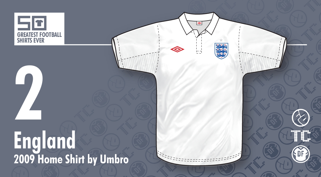
#2 - England 2009-10 Home Shirt by Umbro

It's time for us to reveal the Second Greatest Football Shirt Ever, but which one will it be? So many iconic designs haven't even been mentioned in our countdown so far, and they can't all occupy the final two spaces of our list... so which shirt takes its place at Number 2? The answer is as follows:


Click for larger version
It's England's home shirt, worn during 2009 and 2010. Look up 'understated' in the dictionary and you'll find the above picture in the definition.

A great football shirt can be defined in many ways; complexity of detail, use of colour, acknowledgement of tradition, originality of design, sheer modernity... but this one has its own clearly defined qualities. Here are our comments to hopefully explain why our second best shirt is really all-white...

Thursday, 6 August 2015

#3 - Netherlands 1988 Home Shirt by adidas

Forty-seven shirts down, and now just three to go in our 50 Greatest Football Shirts Ever countdown. Today, it's time to find out who has won our metaphorical bronze medal in our self-appointed valhalla of shirt design, and it's this...
Click for larger version
...the Netherlands home shirt that made as big an impact as the team wearing it during the Euro 88 tournament in West Germany. Worn by the Dutch in only their five games of that campaign, this was proof positive that adidas were truly breaking new ground back in the 1980's... but what specifically catches the eye of the 50GFSE panel?

Here's our thoughts on what makes this shirt Total Genius...

Wednesday, 5 August 2015

#4 - Denmark 1986-87 Home Shirt by Hummel

Stick out your thumb and hitch a ride, everybody - we're heading for Classic Shirt Territory with the latest entry in our 50 Greatest Football Shirts Ever countdown.

Today we bring you the brilliant red home shirt worn by Denmark in 1986 and 1987.


Click for larger version
First worn in the Danes' final World Cup warm-up match against Poland in May of that year, it immediately made an impact with its creative use of pinstripes and contrasting halves, accompanied by the traditional Hummel chevrons running along the sleeves.

But what makes this a superb example of football shirt design rather than garish monstrosity? The 50GFSE panel give you their thoughts...

Tuesday, 4 August 2015

#5 - Liverpool 1985-87 Home Shirt by adidas

Our 50 Greatest Football Shirts Ever countdown has reached the last five - the best five shirts, according to the beliefs of the judging panel. For that reason and that reason alone, we thought we'd share all of our comments for each of the last five shirts, rather than letting one of us divulge our thoughts as a representative for the panel.

With that in mind, we enter the home straight beginning with Shirt No.5 - the Liverpool home shirt worn between 1985 and 1987.


Click for larger version
Directly following the ground-breaking pinstriped design introduced in 1982, this adidas offering might have struggled to match the success of its predecessor, and yet it proved more than popular. So what were its redeeming features and why is it deserving of such high praise in our countdown? Here's what we thought...

Monday, 3 August 2015

#6 - Juventus 1985 Home Shirt by Kappa

When anyone mentions this shirt, it immediately conjures up several names: Platini, Laudrup, Ariston, Tardelli... and er... Rush... maybe...

Click for larger version
There's no doubt this is an iconic shirt, a stone cold classic, but this Top 50 isn't necessarily about iconic shirts - it's about the greatest designs ever, so can it still hold its own on that front?  The answer is OF COURSE IT DAMN WELL CAN!!!!  Just look at the bloody thing!!!! It's beautiful! How dare you even question it?!?! GO TO YOUR ROOM!!!!

Let's put some context around this... and this is where the line between iconic and great start to blur, so forgive me if I occasionally stray into iconography.

Sunday, 2 August 2015

#7 - France 1984-86 Home Shirt by adidas

It's not often you can say that a football shirt is so good that it prompts a number of later tributes to be released, but that's what we have here. France's home shirt, most commonly associated with their winning Euro 84 campaign, was rubber-stamped as a classic when its national team finally staked its claim to be one of the best in the world, and with good reason.
Click for larger version
This was unquestionably one of those moments when you wondered why a shirt with just a few simple elements hadn't been thought of before. It is, at the end of the day, just a blue shirt with one broad red stripe, three thinner white ones below it and three more along the sleeves (as seen on all adidas shirts at the time). So why is it such a beautiful thing?

Saturday, 1 August 2015

#8 - Newcastle United 1995-97 Home Shirt by adidas

It’s not uncommon to associate certain football shirts with a winning period in a team’s history – Argentina in 1986 or Manchester United in 1993, for instance – but association with a particular player is an overlooked phenomenon that happens almost as often. In the case of Newcastle United’s home shirt for 1993-1995, it will always (for me at least) be associated with one player and one player alone – Alan Shearer.

Click for larger version
Not that a single player can elevate a shirt to greatness single-handedly. It just so happens that this one came completely out of the blue and was unlike so many others in its design. What sealed its place in the memories of so many, however, was when it appeared on the wiry frame of the world’s most expensive player when presented to Newcastle fans in 1996.

Friday, 31 July 2015

#9 - Africa Unity 2010-11 Third Shirt by Puma

Click for larger version
This is one of those shirts that frequently finds itself on those lazy 'worst football kits' lists that get trotted out by the papers every season when one club or another releases something different.

In addition to this, it's whole concept could be described as at the extreme of superfluousness, so why is it not only in the Top 50, but also in the Top 10 Greatest Football Shirts Ever?

Thursday, 30 July 2015

#10 - England 1980-83 Home Shirt by Admiral

There's no written rule that says football shirts have to reflect the fashion trends of the era in which they're born, and yet many do. Think of the football shirts of the 1960's: basic, functional, unshowy... Until Twiggy started wearing spangly mini-skirts, the word 'flair' hadn't even been invented.

Then when the 1970's arrived, colour flooded into everything from TV programmes to home décor as creativity and imagination underpinned art, architecture, clothing and much more besides.

And after that, the 1980's came along, where fashions became... well... 'sensible.' But you know what? By the early 1980's, we all needed a bit of sensible. It was time to take stock of what had gone before and forge ahead with understated design that was modern and sleek without being ostentatious.

Click for larger versoin
This was the very essence of how England's 1982 World Cup shirt came to be. Thanks to Admiral Sportswear, the England team had moved from basic unambiguity to tentative boldness with their 1974 kit, but six years down the track, it was time embrace a new decade. Out went the old-fashioned stripes down the sleeves and in came silky polyester, a continental-style collar and bold shoulder panels.

Wednesday, 29 July 2015

#11 - Wales 1976-79 Home Shirt by Admiral

It's time once again for us to welcome a guest writer into the 50GFSE fold, namely Simon Shakeshaft - Welsh football fan and an esteemed authority on the many and varied shirts worn by the national team. Here he is to discuss a classic vision in red, gold and green...

On this countdown the ‘template’ word has already appeared on a number of occasions. This Admiral shirt design is another one of those, a template. No disrespect to Eintracht Frankfurt, Dundee, Saudi Arabia, Vancouver Whitecaps or even Coventry City who actually had it first (even in their infamous shade of russet), but this is probably the most recognisable.
Click for larger version
The FAW joined the pioneering shirt designer’s revolution in 1976, just as the replica shirt market started to really take off, donning the same iconic Admiral ‘tramlines’ design until the end of the decade.

Tuesday, 28 July 2015

#12 - Boca Juniors 1981 Home Shirt by adidas

I must confess to not being much of an expert on South American domestic club kits. I guess the relatively low profile many of the sides have in Britain (or certainly had during my kit awakening in the late '70s) is the reason. In fact probably the only fact I seem to have retained about shirts south of Mexico way is that at some point or other they all seem to have been sponsored by Coca Cola.
However, one South American shirt design has always stuck in my head for its originality, freshness and simple downright coolness,  and that’s the iconic blue and yellow home strip worn by Boca Juniors - arguably Argentina’s most famous club.

Click for larger version
With so many wonderful interpretations of the big and bold design to choose from, its this early-'80s adidas incarnation that just edges it for me. It has a higher-than-usual profile, no doubt aided and abetted by the fact that it was worn by football legend Diego Maradona when he signed for the club in 1981. Proof that a world class footballer can really help get your kit seen and noted around the globe.

Monday, 27 July 2015

#13 - Manchester United 1992-94 Third Shirt by Umbro

We should never let the truth get in the way of a good story, and boy is the background to Manchester United's 1992-94 Third shirt a good story. If you're sitting comfortably, then I shall begin...

Click for larger version
Actually, let's just cut to the chase. The legend goes that Man United's forebear, the Newton Heath (Lancashire & Yorkshire Railway) Cricket & Football Club, were presented with cashmere shirts in green and gold in their second season in existence. In fact, reports of such an item existing are scarce, and it may be not beyond the realms of possibility that until Umbro came up with this supposedly retrospective design to add to their new United Home and blue Away shirts, neither the Red Devils nor their progenitor ever wore green and yellow/gold halves.

Sunday, 26 July 2015

#14 - Italy 2000-01 Home Shirt by Kappa

When a football kit manufacturer decides to rip up the rule book and completely reinvent what's gone before, it has several options to help it achieve its objectives. It can add an eye-catching motif to the shirt here or there - a stripe or a block of colour, perhaps. It can add extra detail or interest to make the shirt more complex in its make-up. Or, as with Kappa's approach to the Italy shirt of 2000-01, it can go in the opposite direction by simplifying things in a brilliantly innovative way. This is the masterpiece that came about from that little exercise:

Click for larger version
There's no other way to describe this shirt: it was quite simply a game-changer. Before 2000, shirts worn by the Italian national team all generally followed the same rules. They had to be royal blue in colour, many had a proper 'flappy' collar and many had a dash of green, white and red as borrowed from Italy's national flag. After a couple of years of towing the line, however, Kappa decided to break free from the conventions of yore.

Saturday, 25 July 2015

#15 - Hull City 1992-93 Home Shirt by Matchwinner

It's fair to say we all had a soft spot for this oft-criticised shirt, but to give it the proper tribute it deserved, we thought we'd hand over the writing duties to Hull City kit expert Les Motherby. Here he his to tell the story of a football shirt with stripes of a truly different kind...

For a kit to become ingrained in the collective consciousness usually requires a team to perform laudable exploits while wearing it; win a major trophy, secure promotion, or at least embark upon a plucky cup run. Not so with Hull City’s 1992/93 home kit, worn during a season of abject failure: The Tigers narrowly escaped relegation from the third tier of English football, exited the League Cup at the first hurdle, and bested only Darlington in the FA Cup before going out in the Second Round.

Click for larger version
It is purely the design that secured this kit’s enduring infamy, which is an impressive feat considering the era, when outrageous designs were legion. Clubs had cottoned on to the money-making potential of polyester replicas released annually rather that every two years, suppliers were pushing design boundaries to show off new printing techniques and a rash of small kit-making firms were keen to make a name for themselves, culminating in an imperfect storm regarding kit design. But whereas most of the, ahem, attention-arresting designs released during that period were used for away kits, it was Hull City’s home kit that would be quite literally wild.

Friday, 24 July 2015

#16 - Ipswich Town 1982-84 Home Shirt by adidas

Earlier in this series we saw how adidas’ instigation of pinstripes in 1980 kick-started a continental influence on kit design. A year later the fashion finally made it to the UK with one of the best examples of the genre - the Ipswich Town shirt worn in the halcyon days of Bobby Robson’s management, sported by stars such as Paul Mariner, Arnold Muhren and Terry Butcher.

Click for larger version
There were (and in fact still are!) plenty of pinstripes around in football, but when they form part of a shirt featuring non-contrasting neck and cuffs they do seem to exude that little extra ‘je ne sais quoi.’ I guess its the perverse nature of stripping away contrasting colour from the functional elements of the design before then adding it again, purely as decoration, elsewhere on the shirt. It's confident (or arrogant?) and extravagant in the extreme, but actually is precisely what you need when you’re dressing a football team when their confidence is paramount to performance.

Thursday, 23 July 2015

#17 - Celtic 2012/13 125th Anniversary Third Shirt by Nike

There are many ways to commemorate an anniversary with shirts; some good, some bad. Celtic's last major anniversary was their centenary in the 1987/88 season, which they celebrated in the typical fashion of the time - adding some wording under or around the crest. Celtic went one better and reverted to their original crest for the season, but that was it. No special shirt, no great pomp and ceremony, or marketing BS... Just a classy shirt with some wording and it worked perfectly. It was classy at the time and even today looks fantastic.

So, 25 years later and with the next major milestone looming, what to do?  The world had changed and with special edition shirts being released almost every day celebrating such mundane things as when some bloke off a student's t-shirt dropped by your place 50 years ago, the big question was how to mark the occasion?

Celtic's answer? Create one of the classiest special edition shirts ever!

Click for larger version
For a start, they replicated the centenary shirt by having a special crest for the home shirt, but this time round they created a special Third shirt as well. What they came up with was a replica of what they wore the first time they played their Auld Firm rivals, Rangers, from May 1888. The kit as a whole was beautiful, with black shorts and green and black hooped socks, but this isn't about the kit as a whole, this is just about shirts... So could the jersey stand on its own? By god yes!

Wednesday, 22 July 2015

#18 - Aberdeen 1976-79 Home Shirt by Admiral

You know, the more I study football kit history the more I appreciate just how big and far-reaching the effects of the Admiral mid-70's kit revolution were. The kit they produced for Aberdeen back then, worn just as the club were beginning a golden era under the managerial reign of a certain Alex Ferguson, is a fine example.

Click for larger version
Prior to 1976, The Dons had enjoyed a succession of relatively plain and simple red kits. Nothing wrong with that of course, but Admiral’s bold approach, born from a need to produce copyrightable designs that could be subsequently sold as replicas and inspired by the ever increasing role of colour TV in the football world, lifted the ordinary Aberdeen kit into something extraordinary.

Tuesday, 21 July 2015

#19 - Argentina 1986 Home Shirt by Le Coq Sportif

Just after the 1986 World Cup had finished, I purchased my first ever Shoot! magazine with a World Cup review in it. On the front cover was Maradona cradling the World Cup trophy, wearing the gorgeous blue and white striped shirt that would beguile me to this day.

Click for larger version
The two things (and this demonstrates how incredibly obsessive I am about this stuff) that hooked me were the fact the central stripe was white and not blue - a rarity for Argentina - and that it was made from an Aertex material. Yes. I really do love a shirt due to the inclusion of holes.

Monday, 20 July 2015

#20 - Olympique Lyonnais 2010-11 Away Shirt by adidas

As with the previously mentioned Marseille shirt, this was from the period where adidas were providing French teams with what some regard as strikingly unique and extravagant designs and other, less educated/cultured folk regard as abominations. I am clearly in the former camp, hence this shirt's initial nomination and, due to the others on this project being of a similar ilk (though not cultured enough to appreciate the aforementioned Marseille shirt), subsequent inclusion in the chart.
Click for larger version
Flouncing in in a deep burgundy, the front is adorned with what appears to be a pattern inspired by a Las Vegas casino carpet and given all the trim is in gold, one could be forgiven for thinking the whole ensemble was conceived somewhere on the Strip.