
 |
| Click for larger version |
But let’s put Alan Shearer to one side for a moment (or as long as I can stretch this article out for, at the very least). This shirt, produced by adidas in 1995, was a vision of sublime simplicity. Its main feature was a white grandad collar which, without the aid of any other complementary elements, was enough to get the football kit design fraternity into something of a tizz.
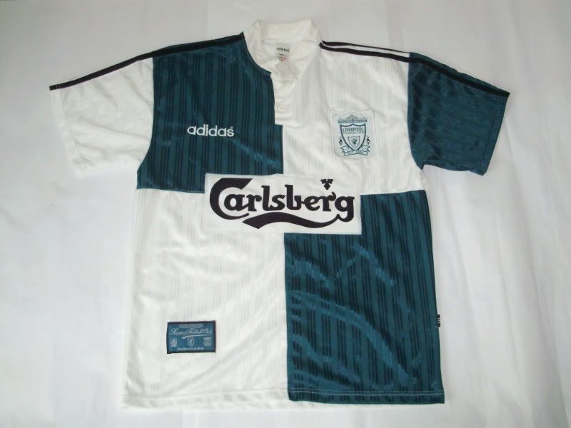
To put this into perspective, hardly any other shirt before it had dared to implement a grandad collar in the entire history of British football. The only other one that springs to mind was also made by adidas and also appeared in 1995 in the form of Liverpool’s green and white quartered away shirt.
Newcastle United’s version had a long hem containing three buttons up to the neckline, and again it’s worth mentioning that, along with the collar, it was white. That’s because all of Newcastle’s shirts since the late-1960’s had featured a collar that was either completely black or had some form of black trim. This one was all the better for being completely colourless and set the tone for understated style that permeated the rest of the garment.
The black and white stripes were also on show, as you’d expect, and the width of those stripes were absolutely spot on in my view. They were wide enough to frame not only the Newcastle badge – still just seven years on from its introduction – but also the manufacturer’s logo in name form only, set on its own black strip. As a final flourish, the iconic three stripes of adidas also made an appearance, but in reverence to the club and its history, they started and finished only on the arms rather than extending to the shoulders and neck.
Throw in an all-new Newcastle Breweries logo to replace the old blue star from previous seasons and you have an excellent shirt that took pride of place among many other great alternatives for the St James’ Park club during the 1990’s. Looking every bit as smart on Alan Shearer’s back as it did on your own, this was another great example of how ingenuity at the design stage can make for a truly stand-out football shirt.
Written by Chris Oakley (The Football Attic).
This shirt is part of The 50 Greatest Football Shirts Ever. The full list can be viewed here.
No comments:
Post a Comment